
moodboard...
- Vanessa Isip

- Nov 30, 2020
- 1 min read
Updated: Dec 12, 2020
We began the process of brainstorming by searching for images that fit the vibe that we're trying to portray in our opening. we want to do a psychological thriller with a cool toned, dark color scheme. We loved the contrast between these darker shades and red, so we're thinking that we may want to incorporate that, as you can see in some of the images below. As for the storyline, we're not sure yet, but making a moodboard helped us to confirm the visual aspects and sort of "aesthetic" of the film opening. (reload the page in case some of the images are cut off, sometimes it glitches:)


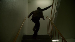


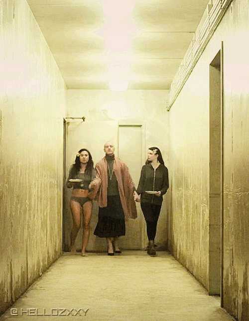
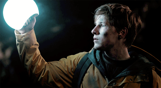


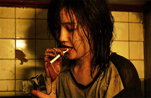


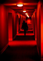


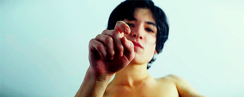


We collectively found that we mostly enjoy the red section of the moodboard. We love the pop of color, and the contrast between the darker, cooler tones and the vibrancy of the red. Perhaps we will use some red props or incorporate an overlay of this colour. Dark, cooler blues, greys and greens, are also very well suited for our color palette.
From the sources we could find, we have images/gifs from:
Suspiria (2018)
We Need to Talk About Kevin (2011)
American Horror Story - Murder House (2011)
Psycho (1960)
Parasite (2019)
Annihilation (2018)
Dark (2017)
Split (2016)
Donny Darko (2001)
Black Mirror - Metalhead (2017)
Georges Méliès - Playing Cards (1896)
Get Out (2017)


Comments